serena peruzzo
data geek, food lover, travel junkie
Visualising language complexity
A little over a year ago, as part of my jobby-job as a consultant, I worked on a proof of concept that explored the possibility of using natural language processing to extract and analyse burdens (obligations) from the Accessibility for Ontarians with Disabilities Act (AODA) (more details about that in this article and this video). Recently, I’ve been thinking about how that approach could be fine tuned and extended to be used to extract useful information from the legislation, and, in doing so, make it more accessible to the public.
As part of this, I’ve been thinking a lot about what are the barriers to understanding laws - what makes them less than accessible. I think that language complexity and ambiguity are big factors, so I decided to explore ways they can be quantified.
It turns out that academics have been thinking about how to measure readability since the late 1800s with early methods relying on word frequencies, which evolved into full on formulas from the mid 1920s. One of the most popular is the Flesch reading ease score:
$$206.835 - 1.015 \left(\frac{\mbox{total words}}{\mbox{total sentences}}\right) - 84.6 * \left(\frac{\mbox{total syllables}}{\mbox{total words}}\right)$$
A higher score indicates material there is easier to read. A lower score indicates passages that are more complex. The highest readability score possible is 121.22, and it can only be achieved if every sentence consists of only one one-syllable word. However, there is no lower bound on the score so that it can potentially be made arbitrarily low by using long sentences with many syllables.
Based on my previous work on AODA I have some hypothesys around which sections are more ambiguous and overall harder to read, so I computed the Flesch reading ease score for each section and built what I’m calling a heatmap of readability. This basically means squishing the text to fit entirely into the screen and coloring the background of each section according to this table. Here’s what it looks like.
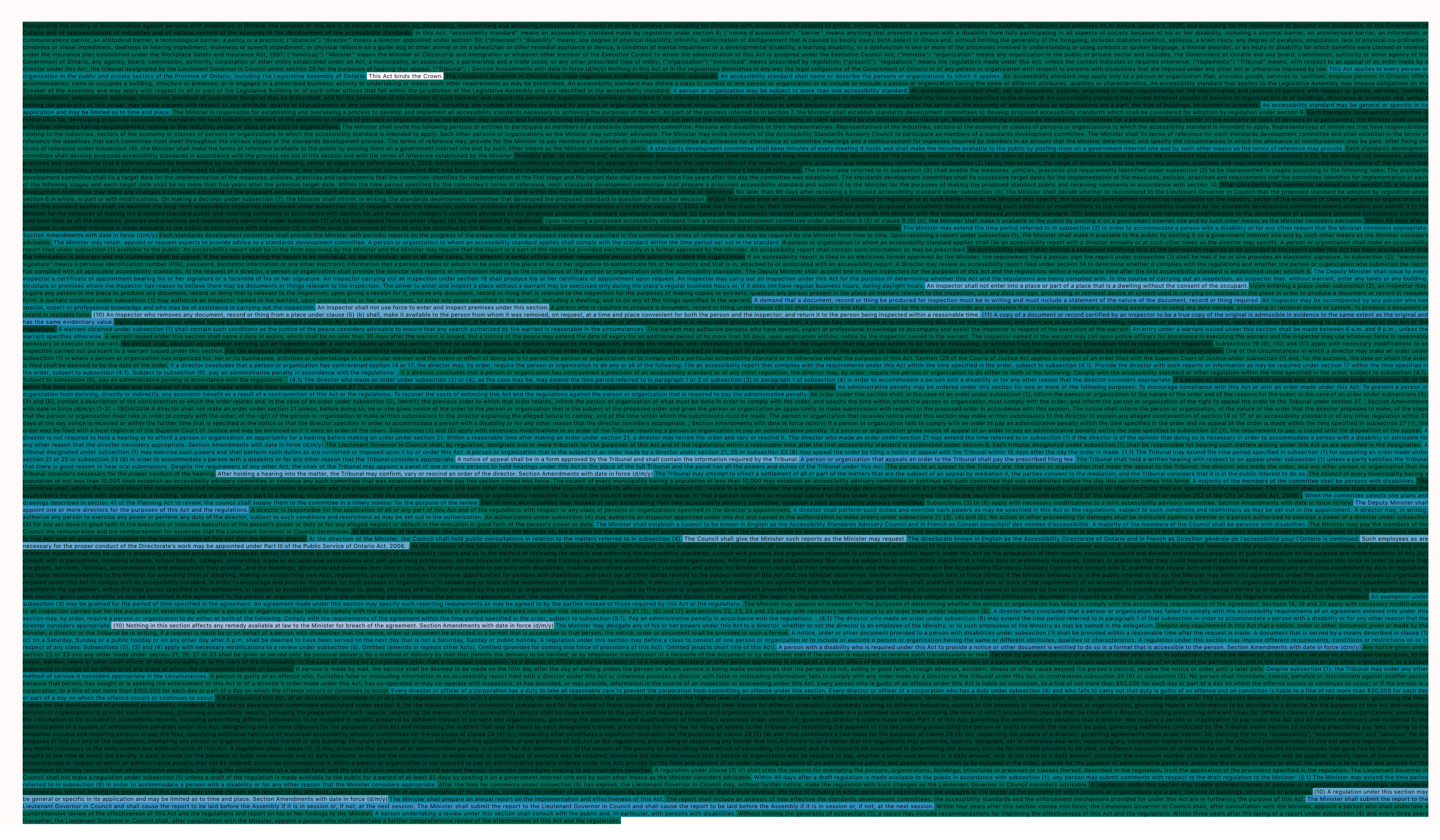
In this picture, darker greens represent lower scores, with the darkest being scores below 0. The average score is ~18 but the minimum is as as low as -197 and only about 40% of the sections score above 30 (though not by much), which is the upper bound for college graduate level texts. For comparison, Time magazine has an average readibility index of about 52 and falls into the 10th to 12th grade level.
The next step, in order to verify my hypothesis, is to combine readability indices with topic analysis and compare them across laws. I think some interesting patterns will emerge from it.